Team Members: Anita Leung, Sarah Zhou, Sasha Klezovich, Allison Chou
Design Rationale
We decided to use this: http://bl.ocks.org/Caged/6476579 D3 template as our starting point.
Since our idea was to show frequency by hour, our group felt that this template would be the best, as it is measuring frequency of a letter. In our adaption, we ended up using it for frequencies of tweets per hour. Our color choices of the light blue bars were inspired off of Twitter's website, as we wanted our viewers to feel a connection to the data. In addition, we added a fade when highlighting over a bar, to make the bar chart appear cleaner as well as highlight which hour the user was focusing on.
For cleanliness purposes, we removed lines, and bolded text, adjusted our tweets to be in our tooltip, removed the word "Frequency:" and just displayed the number above the bars. In addition, we rounded off the numbers to provide the user with enough information, but still keep the visual of our graph clean. We added a x axis label to show what our axis was labelling. Because our graph would most likely be viewed in America, we decided to convert the 24-hour layout time of our data to a 12-hour layout with AM and PM labels.
Our group wanted the data to connect with the user better, so we decided to add in randomized tweets from Trump within that hour. To further add user interaction, users can click on a bar repeatedly to see different tweets during that hour. Originally we had written out the entire tweet, and ran into issues of it running off the page, but later used a similar idea to the tooltip, and put our tweet in there. To further match it with the graph, the tooltip's background is matching with the color of the highlighted bar, so the user can quickly correspond the tweet to the hour.
Development Process
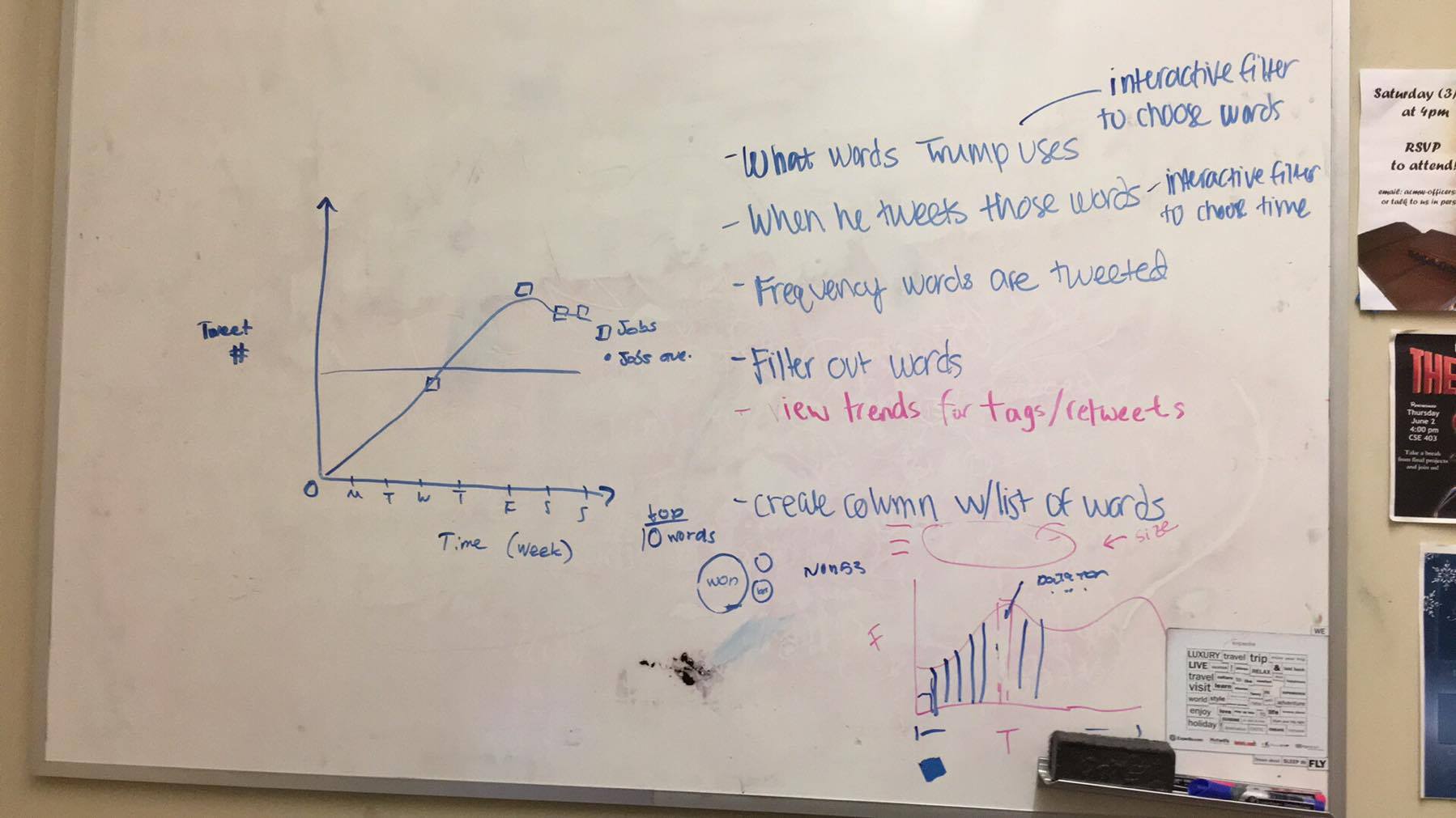
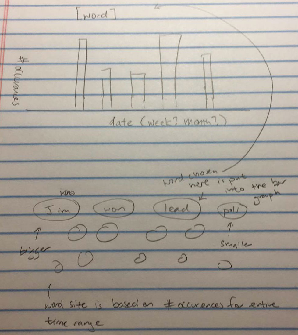
Above is a whiteboard sketch of our original brainstorm. We originally had the idea to create a trend graph, based on the words Trump has tweeted. We had planned to have a bubble word chart that would visually display the number of times he tweeted a certain word when selected. Later, our group ran into complications of not enough data to show an interesting trend - since we only had one year of data, the chances of Trump tweeting the same word that would show meaning behind his tweet (excluding words such as: a, the, I, he, etc.) was very slim. Below is a sketch of our original prototype idea (Courtesy of Anita Leung).
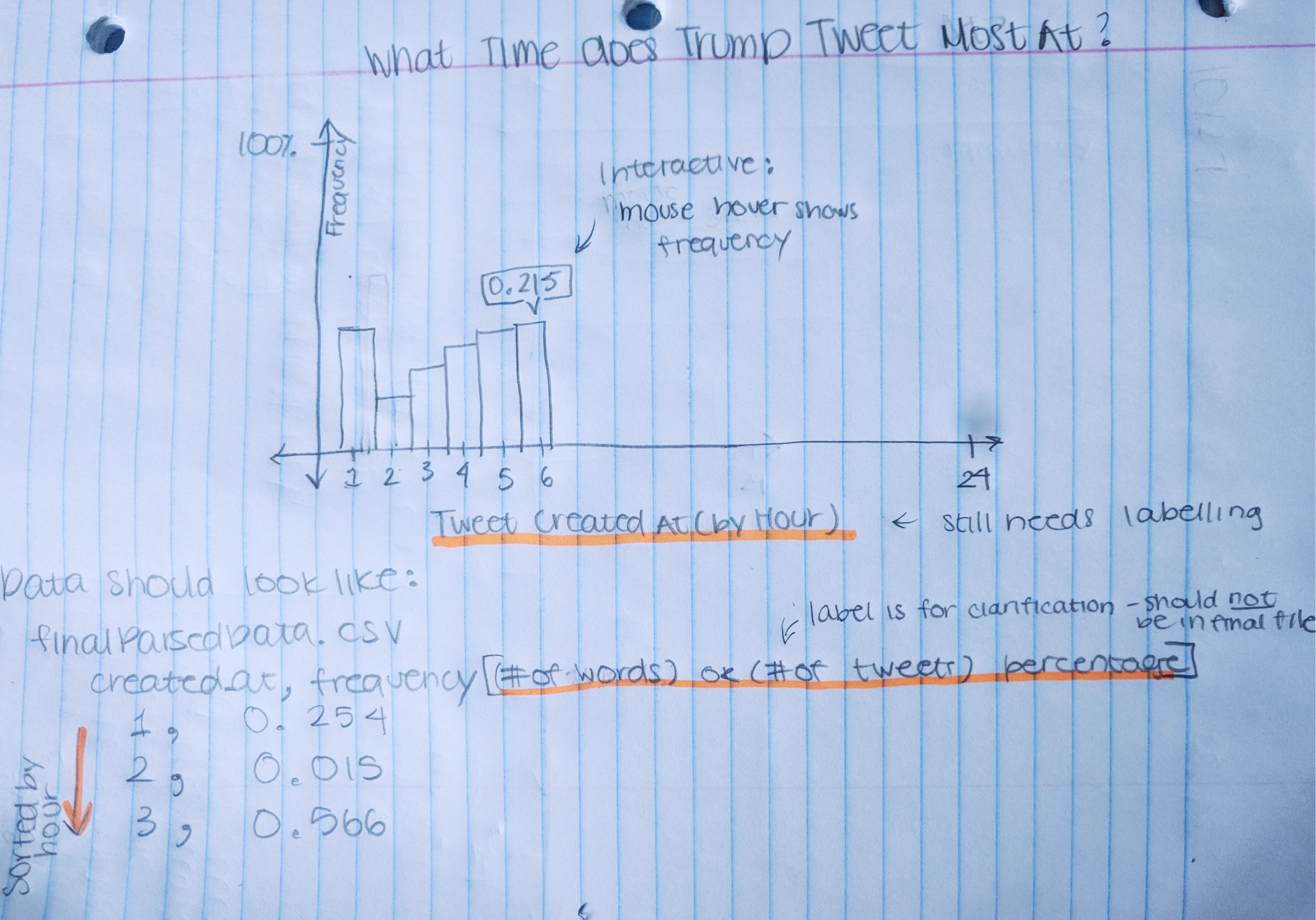
About midway through our development process, our group found this to be a challenge and decided to switch gears into another idea - seeing what times Trump decided was the best times to tweet. We originally created a smaller prototype within a folder called smaller_idea. In this prototype, our group wrote a data parsing algorithm that sorted the hours, and counted the amount of tweets per hour, which was written in Java. Using this data, we created a simple graph that outputs the frequency, when hovered over. Below is a sketch of our second, simpiler prototype (Courtesy of Sarah Zhou).
While testing, we realized that frequencies would be better formed if rounded to 2 decimal points and thus cut them off in the Javascript code. During this process, we wanted to make our graph more interactively interesting, and came up with the idea of displaying a randomized tweet when hovering over a specific hour bar.
We also had run into issues of the tweet running off the page, which we later fixed, as well as deciding to display a new random tweet everytime the user hovered over the bar again.
We had run into technical issues as well. Near the beginning of working on the project, two of our team members had difficulties getting the graph to show. After much Googling, we finally figured out that the graphs weren't showing locally because of cross origin request errors and resorted to using a different browser.
In retrospect, much of our time was spent on deciding on a plausible idea, as well as wrangling the data to be in a usable form for our visualizations. Our group members felt that we spent 20-30 hours each on this project, so in total, we would have spend 80-120 hours on this project.
Our Roles:
We each worked on every stage of the project, from coordination to planning to design to implementation. Further specifics are below.
- Anita Leung - Worked with Tableau and Excel to create csv tables for us to use, such as adding new columns to organize tweets to hours as well as cleaning up the tweet text by removing extra quotation marks and return characters. Added animation to highlight a single bar and fade the others on hover. Implemented the logic for bringing up a different random tweet on each click as well as stylizing the tweet bubbles.
- Sarah Zhou - Implemented starter code for parsing data into a usable format as well as coming up with our simpler protoype, that highlighted based on frequency of tweets. Started off the d3 graph, with a smaller dataset, creating a protoype that later evolved to become our current project. Decided on design color, and format as well as coordinated the group work, and typed out the our design rational and development process.
- Sasha Klezovich - Focused on initial data parsing during intial brainstorm. Shifted to adding and retrieving the randomized tweets that matched each hour with their random displaying over the bars. It proved to be simpler to add them to the orginal frequency data set and then parse for a tweet to display. The biggest challenge was learning and being mindful of D3's syntax.
- Allison Chou - Helped contribute to parsing code via adding to, reformatting, and debugging code. Also worked on graph design such as axes titles and porting over data. Cleaned up and helped reformat data (e.g. illegible symbols, rounding, etc).
Going forward, we hope to possibly break each bar when clicked on to break into the distribution of tweets for that time for each day of the week. This would involve reformatting an additional data set for each day of the week at each time interval along with the counts for each tweet within that range.